
Best Visualization Techniques for Evaluating Large Language Models
When you're comparing large language models like GPT-4o, Claude 3, or Llama 3, numbers alone won't tell you the full story. A model might score 89.7% on accuracy, but what does that really mean? Is it consistent? Does it fail in predictable ways? Can you spot bias just by looking at the numbers? That’s where visualization comes in. Without it, you’re flying blind through a maze of metrics. The right visualizations turn confusing tables into clear stories - showing you not just which model is best, but why.
Why Raw Numbers Don’t Cut It Anymore
LLMs are evaluated across dozens of dimensions: accuracy, reasoning, fairness, speed, robustness, and more. Each benchmark - GLUE, MMLU, HELM, or custom ones - gives you a score. Multiply that by five models and ten metrics, and you’ve got a spreadsheet with 50+ numbers. No human can make sense of that quickly. A 2024 study of 157 LLM evaluation papers found that 78% of them failed to properly show uncertainty in their results. That’s a problem. If a model scores 82.3% with a 5% margin of error, it’s not meaningfully better than one scoring 80.1% with a 3% margin. But without visual cues like error bars or shaded regions, those details disappear. Users end up making decisions based on noise.Bar Charts: The Default - But Not Always the Right Choice
Bar charts are everywhere. In fact, they’re used in 63% of all LLM evaluation visualizations. They’re simple: one bar per model, one color per benchmark. Easy to read. Fast to make. But here’s the catch: they’re terrible at showing relationships. If you want to know whether faster models are less accurate, a bar chart won’t help. You’ll need to flip between two charts. And if you’re comparing five models across eight benchmarks? You’re looking at a wall of bars. It becomes a mess. A 2024 user study with 127 participants showed bar charts were 32.7% faster than tables at identifying the top-performing model. But when asked to spot trends or correlations, users failed 60% of the time. Bar charts are great for ranking. Not for understanding.Scatter Plots: Finding the Hidden Patterns
Scatter plots are where things get interesting. They map two metrics against each other - say, accuracy on the Y-axis and inference time on the X-axis. Each point is a model. You instantly see clusters, trade-offs, outliers. For example: GPT-4o sits at 89.7% accuracy and 120ms response time. Claude 3 is at 82.3% and 150ms. You can see GPT-4o is both more accurate and faster. That’s a clear win. But what about a model at 85% accuracy and 300ms? Is it worth the delay? The scatter plot tells you. Studies show users identify relationships in scatter plots with 89.4% accuracy - far better than tables (63.2%). But scatter plots break down with more than two dimensions. Add fairness score or toxicity rating? You’re stuck again.Token Heatmaps: Seeing What the Model “Paid Attention To”
This is where you get inside the model’s head. Token heatmaps show which words or phrases in the input or output had the most influence on the model’s decision. Red means high importance. Blue means low. In the Boundless DAS method, tokens with importance above 0.8 glow red. Below 0.2? Blue. This helps you spot if a model is relying on stereotypes - like giving a high score to a response only because it contained the word “doctor” when the subject was female. Or if it’s ignoring key context in a question. Heatmaps are 92.1% effective at revealing token-level behavior. But they’re also the hardest to interpret. Novice users misread them 41.3% of the time. You need to understand attention mechanisms. You need to know what “importance” even means here. It’s not magic. It’s math. And if you don’t know the math, the heatmap looks like noise.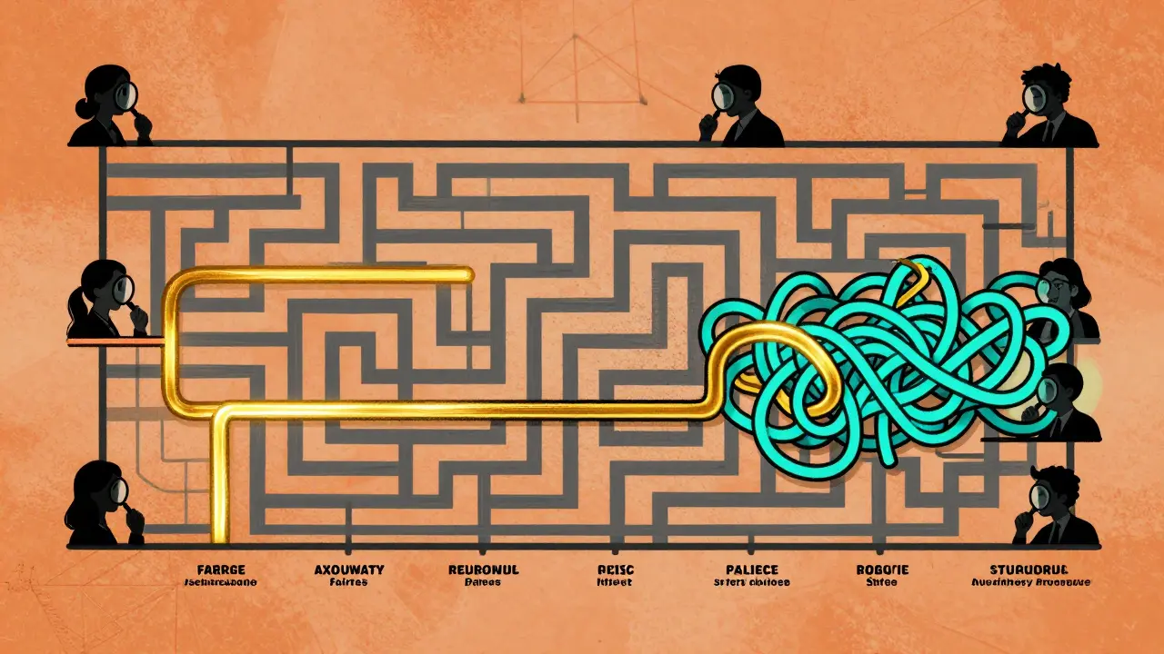
Line Charts: Tracking Progress Over Time
If you’re training or fine-tuning a model, line charts show how performance changes. Did switching from 7B to 70B parameters boost MMLU scores from 38.2 to 52.8? That’s a 38.5% jump - visible in a single line. Line charts are used in 19% of evaluations. They’re perfect for showing trends: accuracy improving with more data, latency rising with context length, fairness worsening after a certain training epoch. But they only work if you have time-series data. You can’t use them to compare five different models at a single point in time. That’s where bar charts still win. Line charts are for evolution. Not comparison.Parallel Coordinates: The Power Tool for Experts
Imagine you’re evaluating a model across 12 metrics at once - accuracy, bias, speed, creativity, coherence, safety, etc. How do you visualize that? Enter parallel coordinates. Each vertical line is a metric. Each model is a colored line crossing through all 12. If one model’s line stays high on accuracy, fairness, and safety - but dips on speed - you see the trade-off instantly. The EvaLLM framework uses this technique. It can handle up to 500 evaluation points before slowing down. But here’s the catch: with more than 300 lines, it becomes a spaghetti mess. GitHub users report this as the #1 complaint. This isn’t for casual use. It’s for research teams with deep domain knowledge. And even then, you need filtering. Click to hide all but the top three models. Zoom in on just the safety and bias axes. Without interactivity, it’s useless.Causal Graphs: Uncovering Bias and Harm
Not all evaluation is about performance. Sometimes, it’s about harm. Did the model refuse to answer a question because the user was female? Did it generate harmful stereotypes when prompted with “nurse” or “CEO”? Causal graphs, like those in Causal Auditor, map inputs to outputs with arrows showing strength of influence. A thick red arrow from “gender: female” to “response: nurse” flags bias. A weak blue arrow from “country: Nigeria” to “response: poor infrastructure” shows underrepresentation. These aren’t just pretty pictures. They’re diagnostic tools. They show you *why* a model fails - not just that it fails. And that’s critical when deploying models in healthcare, hiring, or law.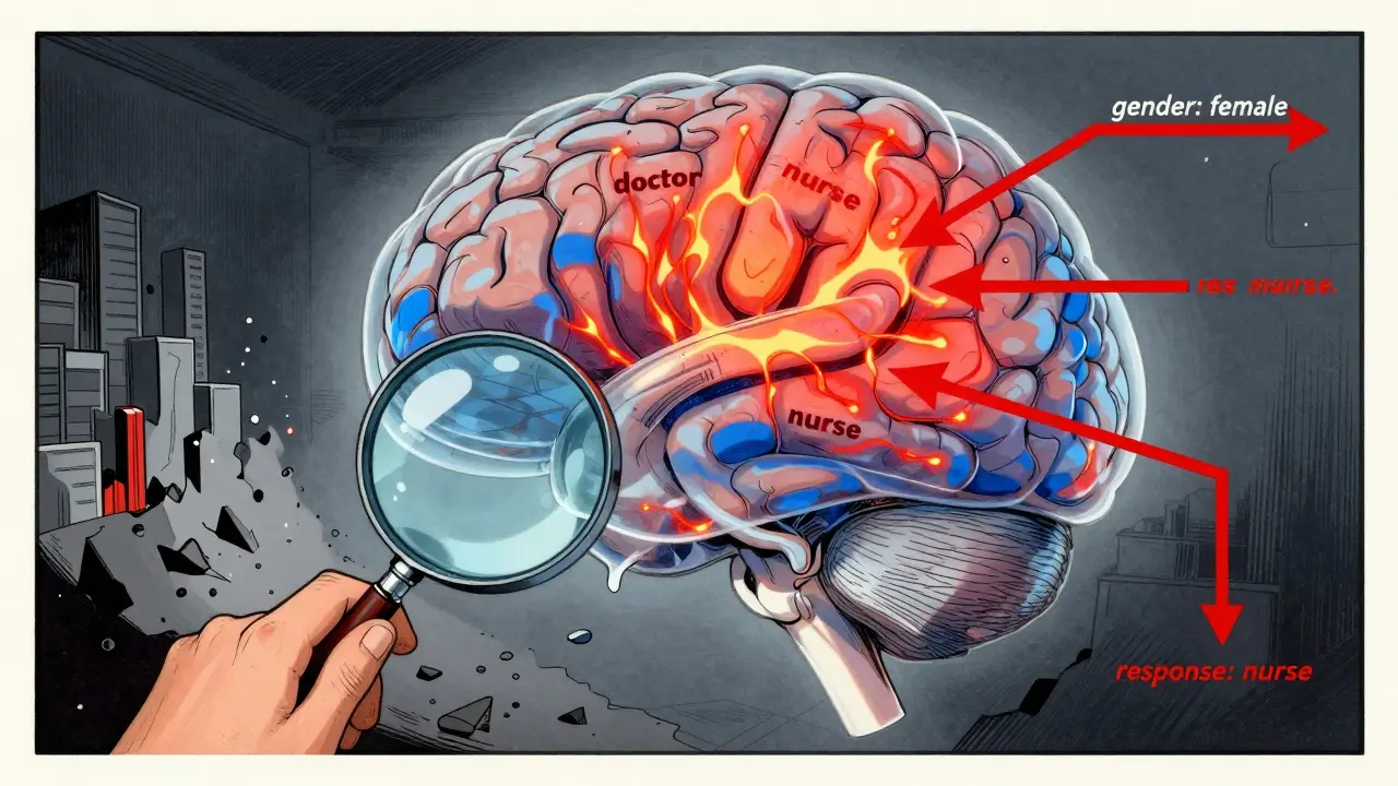
What Tools Are People Actually Using?
You don’t have to build this from scratch. Several open-source tools are gaining traction:- LIDA: Generates visualizations from natural language prompts. Used by 42% of researchers. Praised for speed, criticized for occasional misleading outputs.
- NL4DV: Turns text into Vega-Lite charts. Accurate but plain-looking. Popular among academics who need reproducibility.
- EvaLLM: Built for multi-metric evaluation. Highest user rating (4.5/5). Steep learning curve.
- Weights & Biases, Arize, Evidently AI: Enterprise tools. Better integration with MLOps pipelines. Costly but scalable.
Common Pitfalls and How to Avoid Them
Even experts mess this up. Here are the top three mistakes:- Ignoring uncertainty: Always include error bars, confidence intervals, or shaded regions. If you don’t, you’re lying by omission.
- Using inconsistent colors: Red always means “bad” or “slow.” Don’t switch meanings between charts. Use standardized palettes like ColorBrewer.
- Overloading visuals: One chart, one story. Don’t cram accuracy, speed, fairness, and toxicity into a single heatmap. Split them.
The Future: Adaptive, Multimodal, and Regulatory
The field is moving fast. By 2027, 92% of LLM evaluations will include interactive, multi-dimensional visualizations - up from just 47% today. Why? Because models are getting more complex. And so are the risks. New techniques are emerging:- Adaptive visualization: The system picks the best chart type for your data - no manual selection needed.
- Multimodal evaluation: Now models process text, images, audio. Visualizations must show how each modality affects output.
- Regulatory pressure: As LLMs enter finance, healthcare, and government, regulators will demand transparent, auditable evaluations. Visualization won’t be optional - it’ll be required.
Where to Start
If you’re new to this:- Start with bar charts for ranking models.
- Add scatter plots to compare accuracy vs. speed.
- Use LIDA or NL4DV to auto-generate visuals from your evaluation results.
- Always include uncertainty.
- Use consistent colors.
- When you’re ready, explore parallel coordinates or causal graphs for deeper analysis.
What’s the best visualization for comparing multiple LLMs on different benchmarks?
For comparing multiple models across several benchmarks, a grouped bar chart works best for quick ranking. But if you want to see trade-offs - like accuracy vs. speed - use a scatter plot. For more than five metrics, try parallel coordinates in EvaLLM, but only if you can filter and zoom. Avoid tables - they’re too slow to interpret.
Can I trust AI-generated visualizations like those from LIDA or GPT-4o?
AI tools like LIDA generate visuals quickly and correctly 89.4% of the time for standard charts. But they struggle with complex ones like radar charts or multi-layered heatmaps, dropping to 42.3% accuracy. Always double-check the underlying data. Use AI to draft, not to decide. GPT-4o is the most accurate generator tested, but even it makes mistakes.
Why do some visualizations make models look better than they are?
Because they hide uncertainty. Many charts show single-point scores without error bars. Others use misleading scales - like starting the Y-axis at 80% instead of 0% to exaggerate differences. Always check the axes, the range, and whether confidence intervals are included. If they’re missing, the visualization is incomplete - and potentially deceptive.
Do I need to learn Python to create these visualizations?
You don’t need to code if you use tools like LIDA or NL4DV - they work from natural language prompts. But if you want to customize visuals, fix bugs, or integrate with your evaluation pipeline, Python with libraries like Plotly or Seaborn is essential. Most enterprise teams use Python. Beginners can start with no-code tools and learn coding later.
Are there free tools I can use right now?
Yes. EvaLLM, LIDA, and NL4DV are all open-source and free. They run on Python and require basic setup - API keys for LLMs, 16GB RAM, and a modern browser. For enterprise use, free tools have limits. But for research or personal projects, they’re powerful and fully capable.
How do I know if my visualization is effective?
Ask someone unfamiliar with the data: Can they tell you the top model in 10 seconds? Can they spot a trend or trade-off? If not, simplify. Remove clutter. Use color intentionally. Add labels. Test it. If they need a legend longer than three items, it’s too complex. Good visualizations don’t need explanation.


bar charts are trash for anything beyond ranking
just use scatter plots and move on
you people still using bar charts in 2025? wow. if you can't see that scatter plots reveal trade-offs and heatmaps expose bias, you shouldn't be evaluating models at all. i've seen teams waste months because they trusted single-point scores. error bars aren't optional, they're ethical. and don't get me started on color schemes - if your chart uses rainbow gradients, you're not a data scientist, you're a toddler with crayons.
While I appreciate the thoroughness of this analysis, I must emphasize the importance of methodological rigor in visualization practices. The consistent use of standardized color palettes, such as those recommended by ColorBrewer, is not merely a stylistic preference-it is a critical component of reproducible research. Furthermore, the inclusion of confidence intervals and uncertainty quantification must be treated as a non-negotiable standard, particularly when models are deployed in high-stakes domains such as healthcare or criminal justice. Let us not forget: visualization is not decoration; it is documentation.
Love this breakdown! Honestly, I started with bar charts because they felt safe, but once I tried scatter plots for accuracy vs. latency, everything clicked. I was able to spot that one model was a total outlier-super accurate but so slow it was unusable. And LIDA? Game changer. I told it ‘show me which model is best for speed and fairness’ and it gave me a perfect parallel coord chart. No coding, no headache. Just don’t forget to double-check the data it pulls-AI’s great, but it still hallucinates sometimes.
so you’re telling me i need to learn parallel coordinates just to compare 5 models??? bro i just wanna know which one doesn’t write racist poetry
also lida generated a chart where ‘accuracy’ was on the x-axis and ‘speed’ was on the y-axis and i thought it was a typo until i realized it was just… wrong. ai tools are cool until they make you question your sanity
Man I used to think heatmaps were just fancy noise until I saw one reveal a model was giving higher scores to responses with ‘he’ instead of ‘she’ when talking about doctors. That’s not a bug-that’s systemic bias baked into training data. And yeah, they’re confusing at first, but once you get the color scale, they’re like X-ray vision for LLMs. Just pair them with causal graphs and you’re basically doing forensic AI analysis. No wonder regulators are coming for this stuff. We’re not just building models anymore-we’re building decisions that affect people’s lives. And if your viz looks like a toddler’s finger painting? You’re not just behind-you’re dangerous.